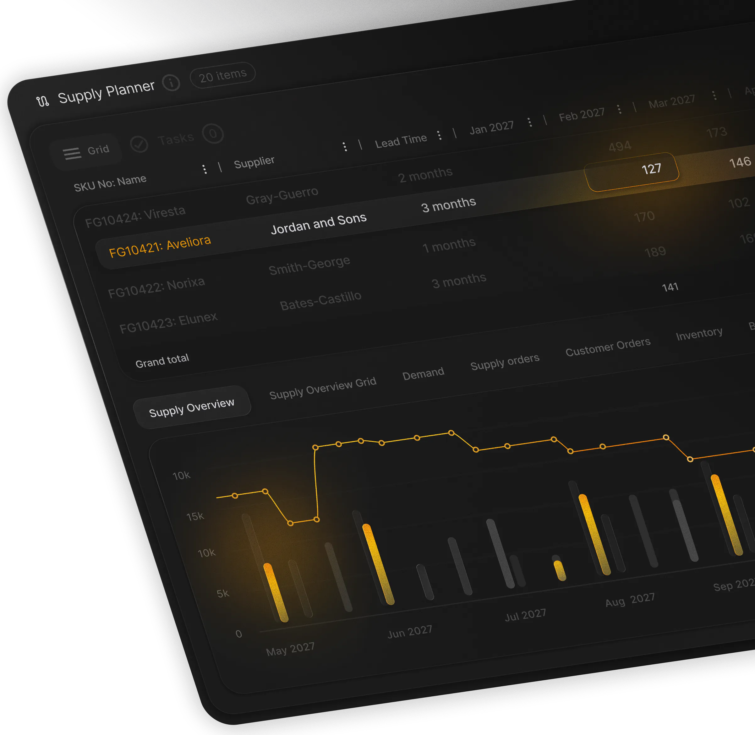


Most planners that work for pharma companies I have met live in spreadsheets. They are familiar, flexible, and they are where the real work happens, right up until the point where they stop being enough.
A grid cannot hold the whole story
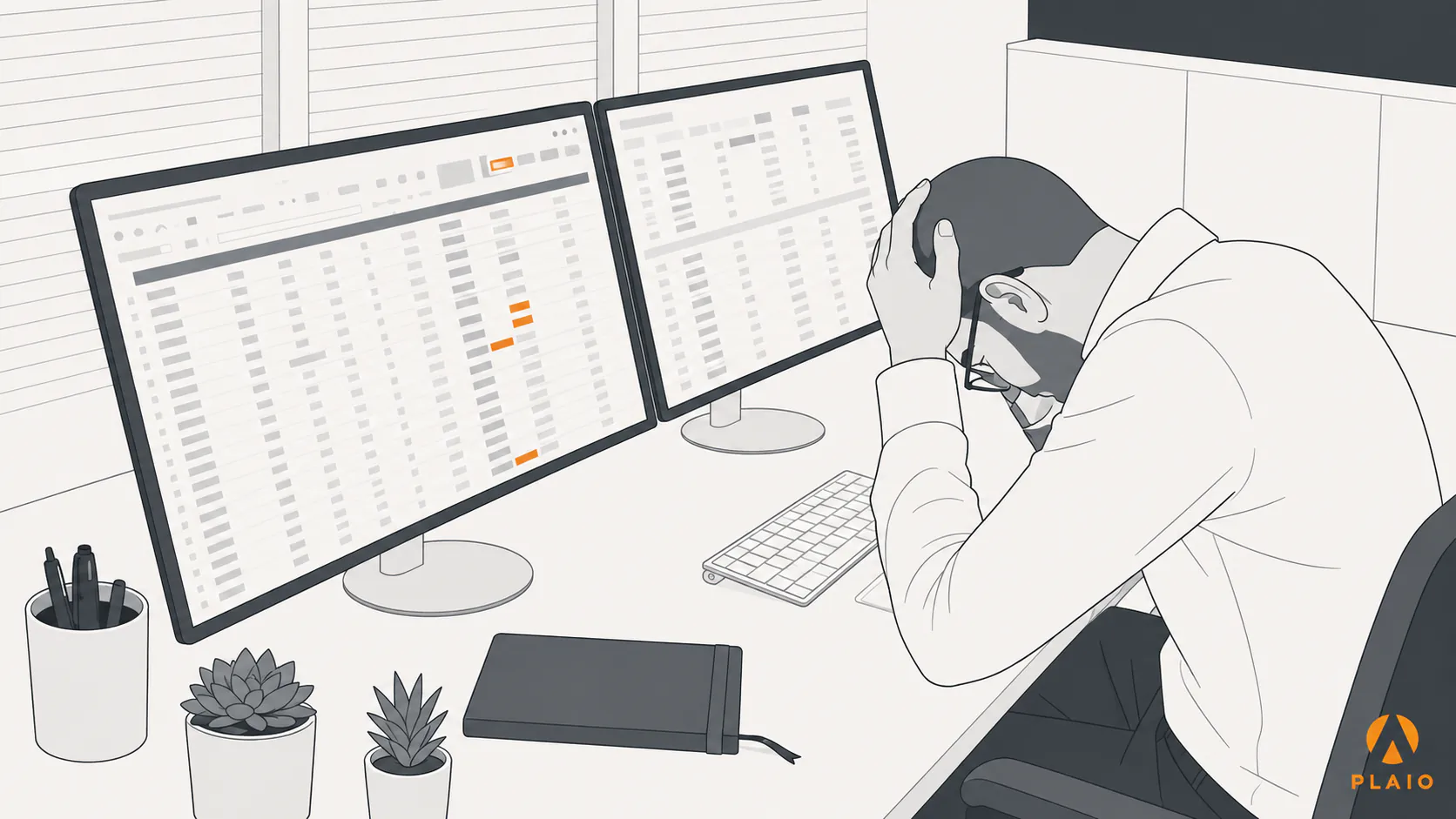
When we started building PLAIO, we digitized the experience of spreadsheets, since that was the world most planners already knew, and layered smarter automation on top of the patterns they were used to.
It did not take long to see that this was not quite enough. Once the dimensions of time and nested data come into play, a two-dimensional grid cannot easily communicate the state of a supply chain, neither for the planner trying to understand their own reality, nor for the people downstream who depend on that information to do their work.
The difficulty grows because planners do not work against a single reality. They hold several at once: plan A, plan B, and plan C. A digital tool cannot show all of it, even when the technology allows it, and its job is to surface the portion of the story that is actionable, so people can predict, stay compliant, and react with less cognitive load.

Why this is not a typical product challenge
For those outside the domain, imagine planning a large wedding: a venue, caterers, entertainers, printers for the invites, and all the logistics to bring it together. Now imagine those suppliers are often unreliable, and it is your job to always have multiple contingency plans to cover the unexpected. That is roughly what reality looks like for pharma supply chains, except people’s health and lives are often on the line.
This makes for an unusually rich design and product problem, and one I find exciting to work on, since few designers or user-experience professionals have spent time solving it. I believe the people who manage supply chains have a deep need of a surface where they can easily understand their own reality and share that same source of truth with everyone who depends on it. The goal is to make such a tool simple to grasp and quick to adopt.
The design problem underneath it: our Allocation Manager
One such hard problem was the Allocation Manager. For a long time we struggled to represent the consumption and allocation of batches through time. Medicine is produced in traceable batches, and those batches are allocated and reserved for packaging. But how do you show this in one simple grid without causing even more confusion? Normalizing a grid with common column structure, and explaining what was happening through text alone became impossible. We tried a node structure, but that couldn’t describe changes over time.
Below is the solution we ended up with after many iterations:
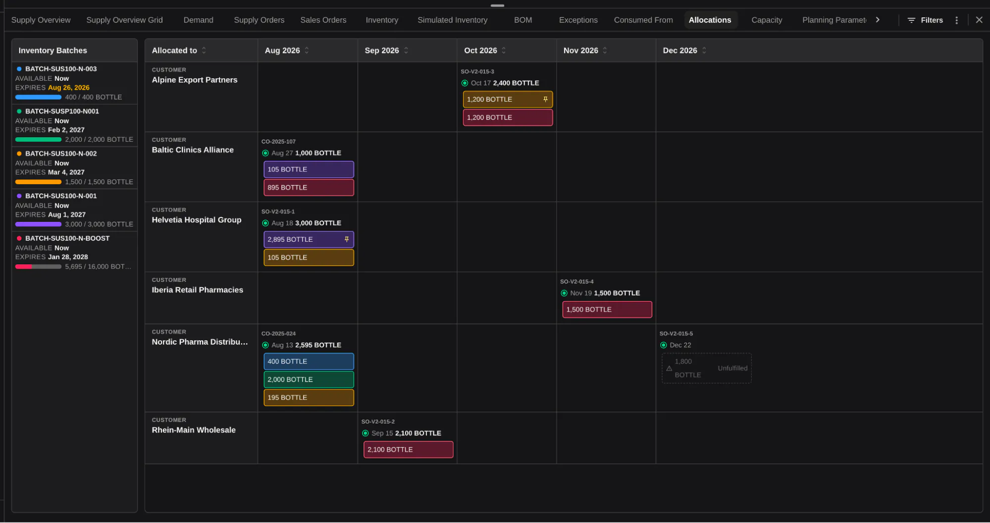
The interface holds two views at once: a timeline of the items that consume from allocated batches, and alongside it a list of batches ordered by production date, including virtual batches that stand in for future manufacturing runs. Each carries its own nested data of quantities, batch numbers, and expirations. I have not seen this handled quite this way elsewhere.
The solution came from an unlikely mix of my earlier work in game development and in film post-production. Game interfaces are heavy on holding many statuses and associations at the same time; editing tools specialize in nested timelines, where film clips sit on a list that can be placed on a master timeline. Combining those ideas, interviewing users, and getting clear on the questions they were actually trying to answer produced our visual interpretation of batch consumption.
Where this is going: agents and the humans in the loop
This is where we keep pushing. Much of this work carries process and tribal knowledge that resists full automation, and even where it could be automated, the data-structure cleanup and change management involved would make doing so cost-prohibitive. So for the hard problems people still solve by hand, we build a product that shows the trade-offs clearly and makes those decisions easier.
That same surface is what carries the product into an agentic world. Agents now handle a larger share of what used to be manual, and can process far more information than any one person, but they still have to show their work somewhere a human can read it. The shared surface is where people see and verify what the system suggests, rather than take it on faith. In the regulated industry our product serves, that verification is a hard requirement.
Closing
Making supply chains simple is not easy. It takes research, iteration, and tenacity. We keep going because we are passionate about helping our customers and the people they serve.
If you plan in a world of competing realities, I would like to hear how you keep them straight: what breaks first when a spreadsheet stops being enough?